UX/UI Design
Nielsen sports
Working with the global leader in sports intelligence to build
a dashboard that engages users around the world.
Background
I joined the Nielsen Sports team post MVP launch. The goal for the project was to begin gathering user feedback that would help drive the product roadmap.
Challenges
The initial MVP was built with little user research. Since this was a new dashboard, I did not have the option to rebuild large portions of the system to accommodate improvements and enhancements. There were multiple levels of product owners, managers and executive leadership that needed to agree on the roadmap and how to execute each enhancement.
My Role
My role for this project was as the lead designer, working with other designers, product owners, engineering and executive leadership through the project lifecycle.
Tools Used
Sketch
Invision
JIRA
Google Hangouts
Accessing Big Data Through Small Actions
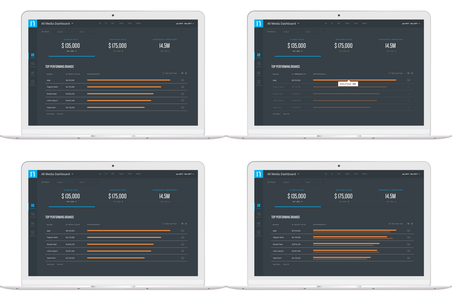
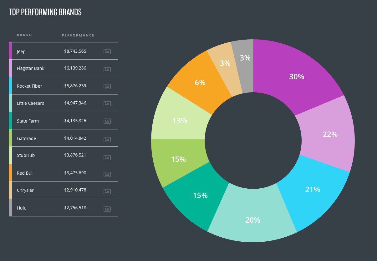
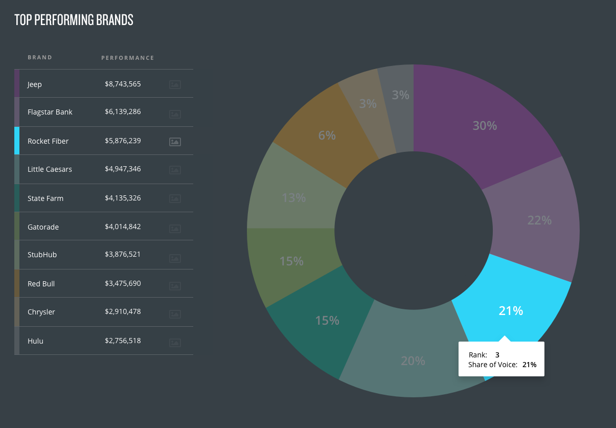
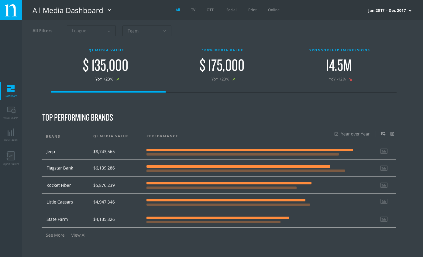
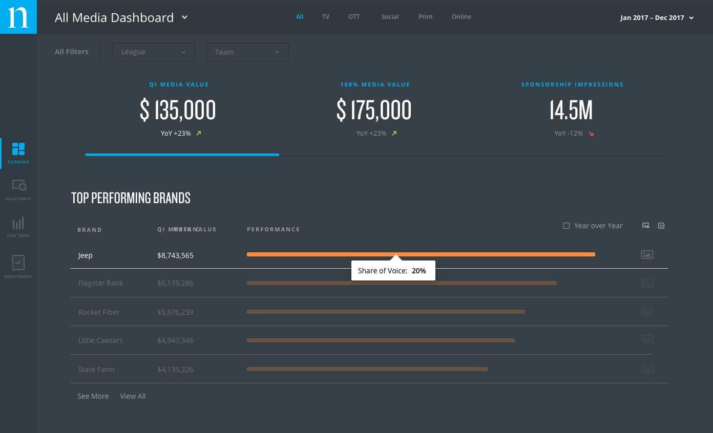
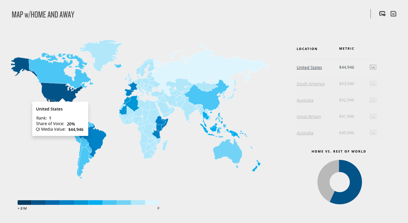
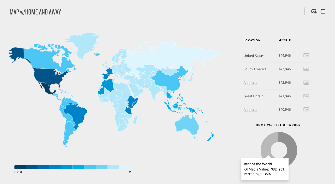
I joined the Nielsen Sports team shortly after the MVP launch of the Connect dashboard. Post MVP, user research indicated the need to surface additional KPIs that could be quickly accessed without having to leave the page, or export a spreadsheet.
I worked with the product team, senior leadership and internal stakeholders to identify key micro-interactions that would enhance the powerful analytics being collected. Micro-interactions were the perfect solution to add a new layer of UX to the dashboard because they allow the user to quickly interact with the information without introducing a new workflow.
Report Builder
One of the major pain points we heard from users was the time-consuming process of exporting data from the dashboard into usable formats for them to use in presentations. Phase 2 of this project was to identify a solution that would streamline this process and provide users with options to customize the data using engaging visuals they could import directly into PowerPoint.
Step 1 – The Set-Up
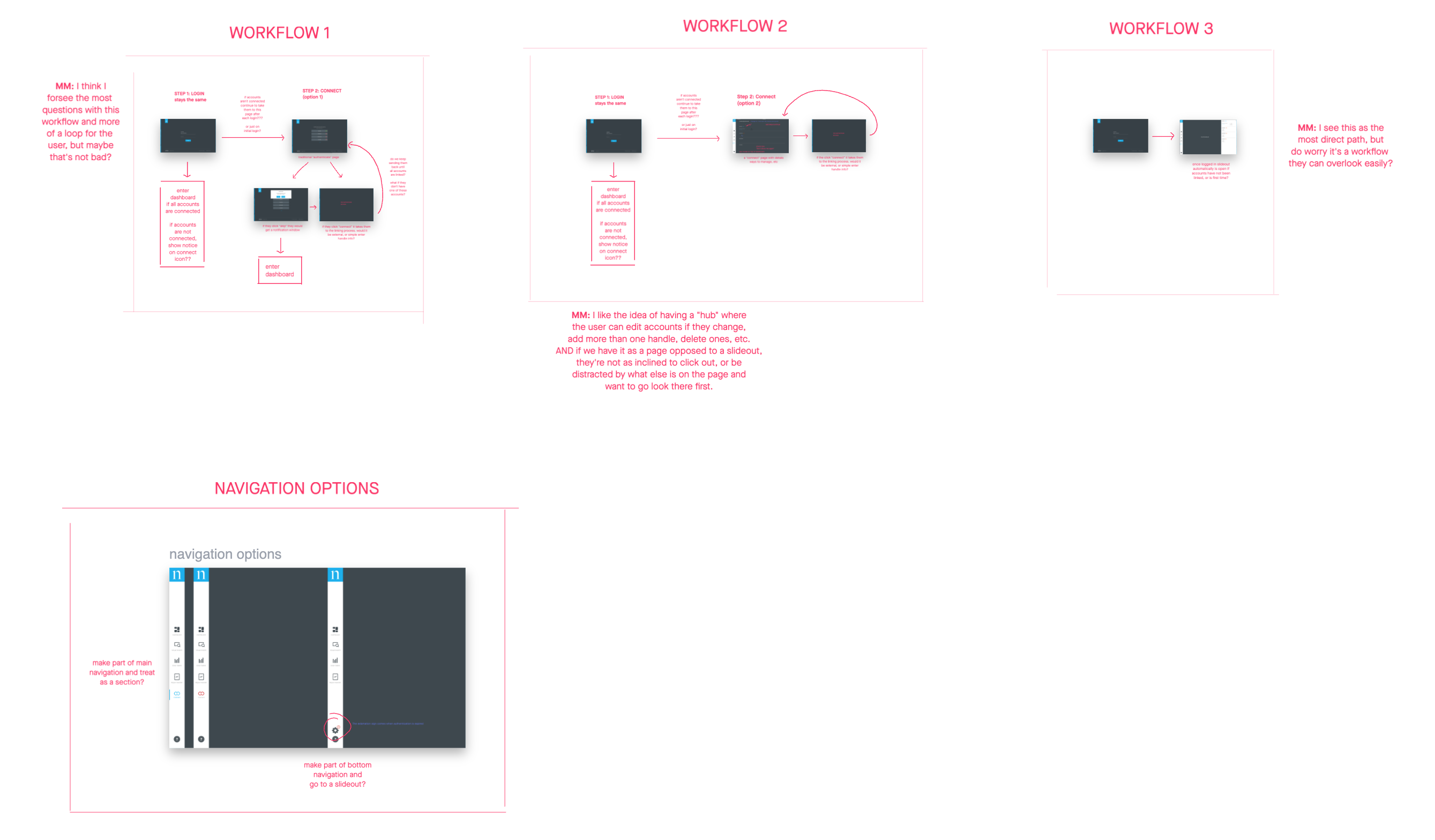
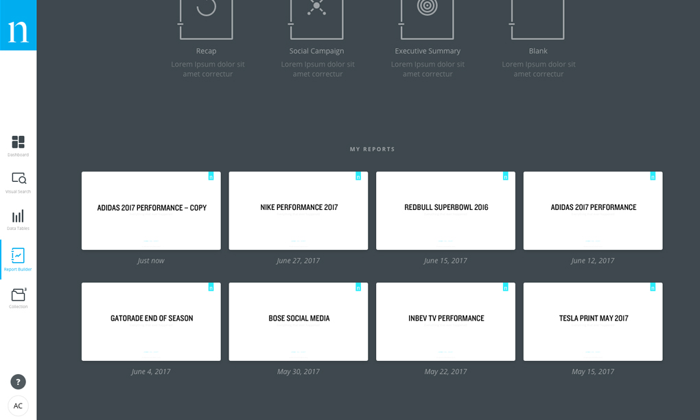
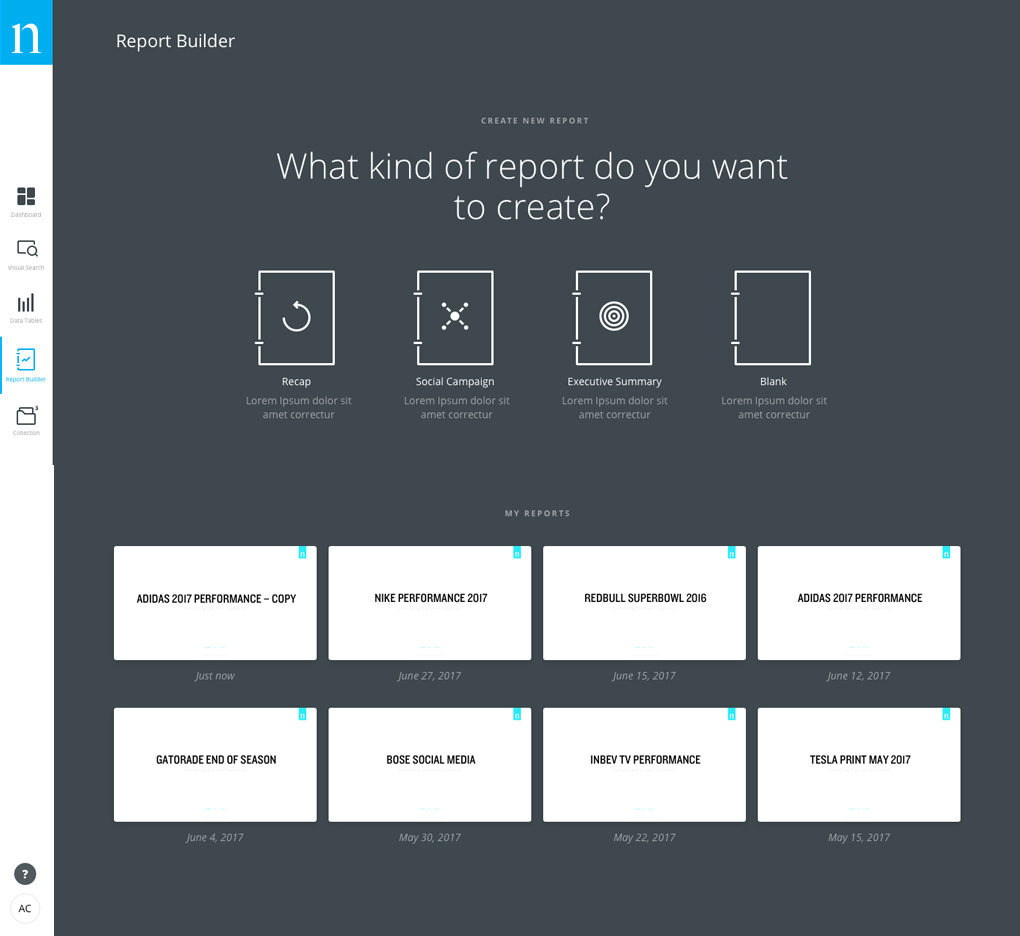
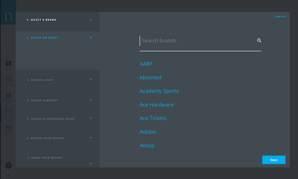
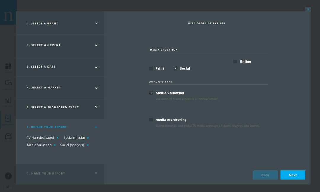
Report Builder begins by having the select to either create a new custom report, or access one they have previously created. If they are creating a new report, they are guided through a wizard that helps them easily start the process. We did have to do some initial mapping to understand how the new feature would be accessed within the current navigation.
Step 2 – Customizing the Data
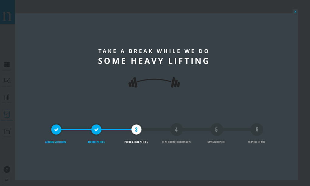
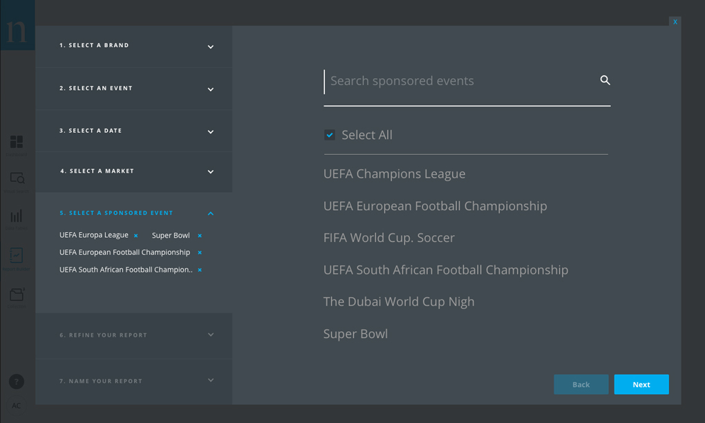
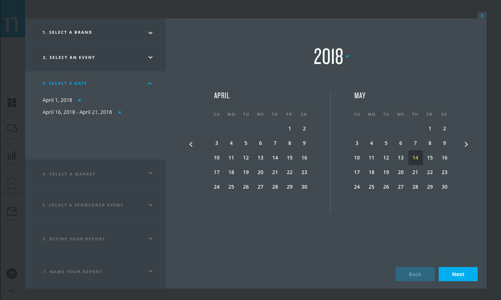
Through a step wizard, the user selects the type of data they would like to export into their custom PowerPoint slides. The key to this step was to keep the huge amount of data organized so the user doesn’t get overwhelemed.
One of the biggest challenges while designing this step was to plan for numerous scenarios that would hinder the user from creating their desired report. What if the dates they selected didn’t have reportable data? What if only some of the dates had data? What if the dates they selected didn’t fall within a given sports season? This phase of the project required close collaboration with the engineering team.
Step 3 – The Magic!
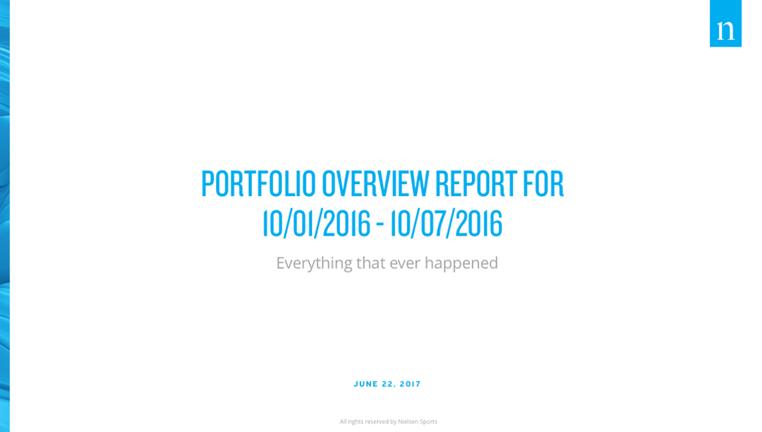
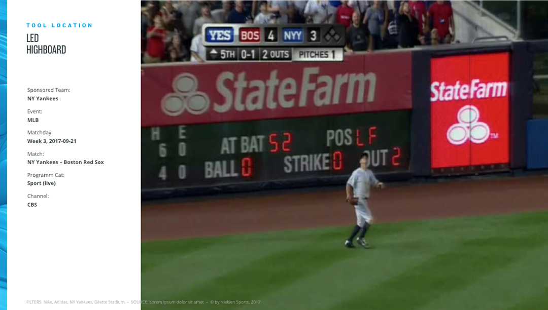
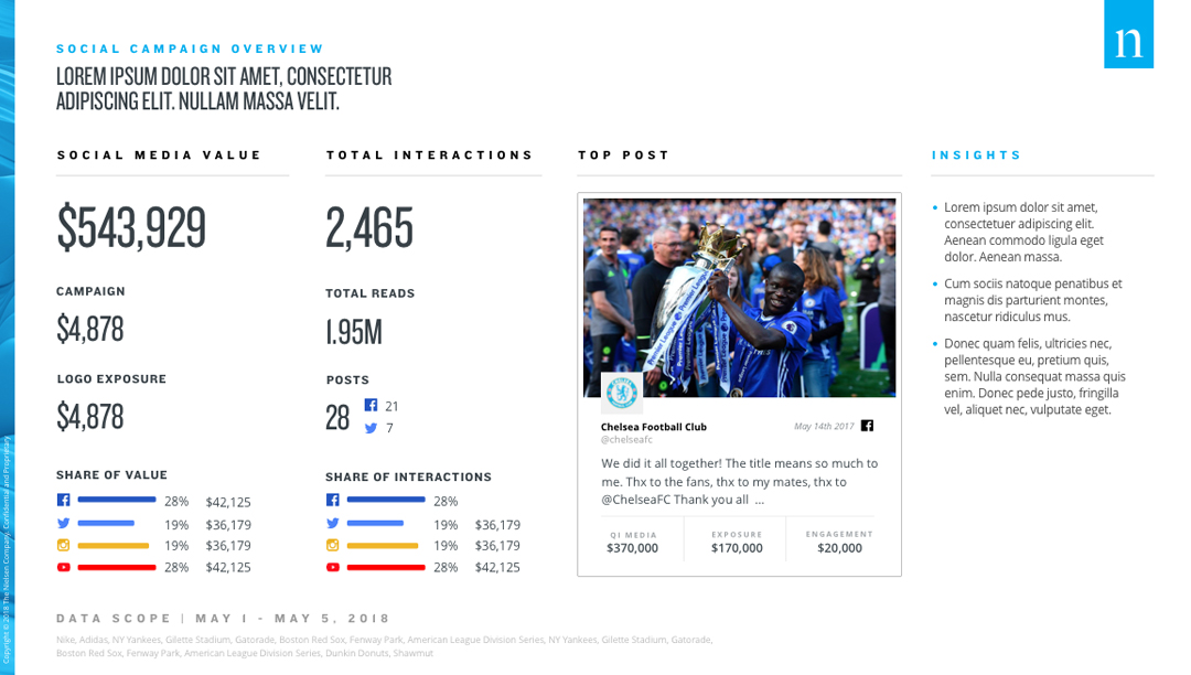
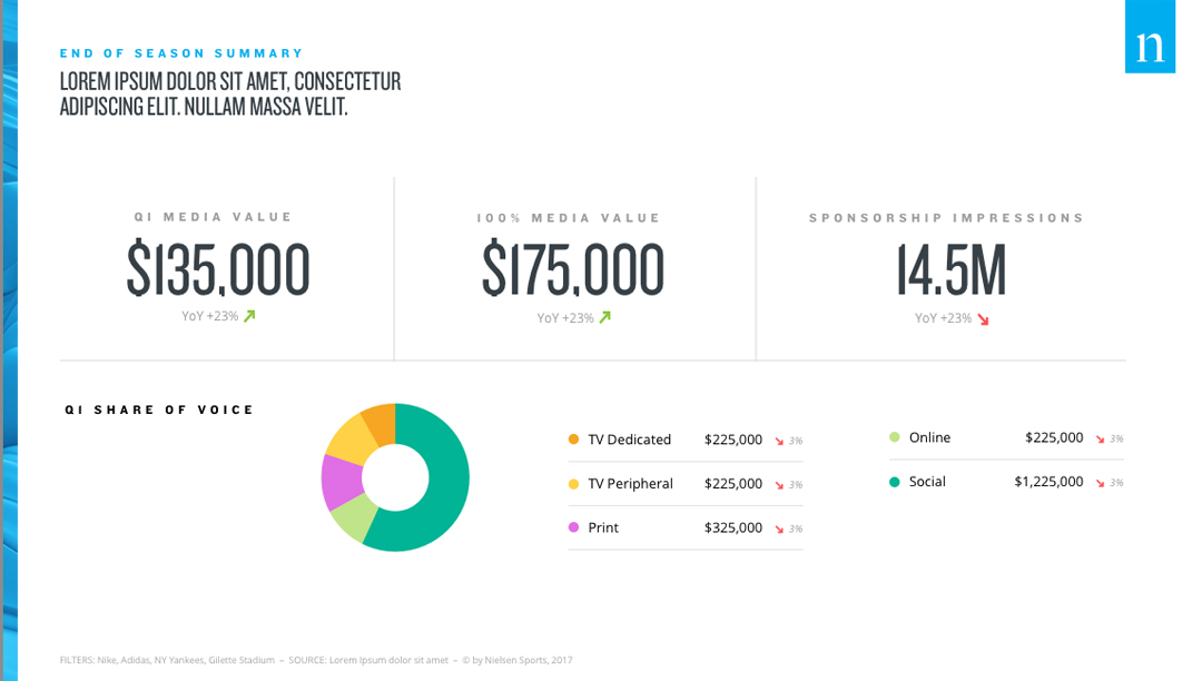
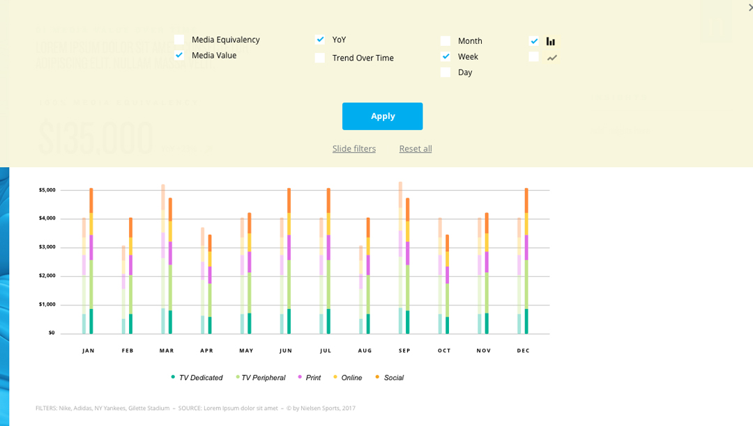
Once the heavy-lifting was complete, the user is presented with dashboard generated PowerPoint slides. This phase of the project had more challenges than expected. We wanted to make sure the charts and data were representative of the Connect dashboard, but had to work within the limitations of PowerPoint. We wanted to provide the user the ability to customize specific elements of the slides to adjust the data if needed, but eliminate the possibility of the data being accidentally edited in the process.
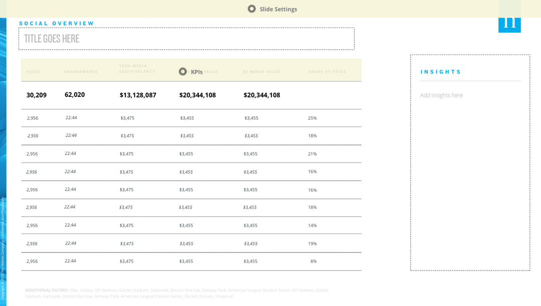
A New Level of Data Interaction Begins
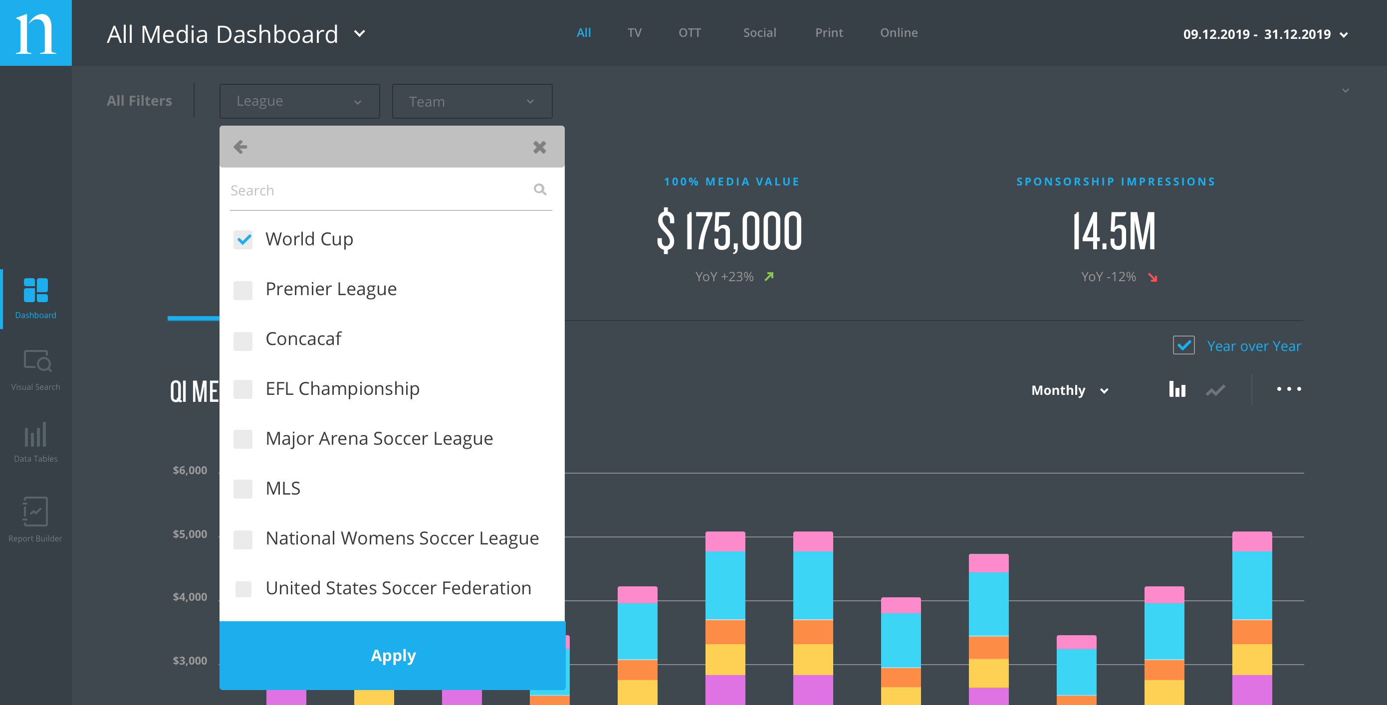
Post MVP, I began collaborating with the product owners to pinpoint areas of improvment based off user feedback. Filtering capabilities became a top priority to allow users to quickly analyze information on a day to day basis. Our solution was a filter tool that provided quick filter options, as well as specific filter parameters.

Get Social
An additional area we began to focus on was improving the functionality for the social data section. Users wanted the ability to create custom hashtags for internal campaigns and keep track of those hashtags within the dashboard that was quick to turn on and off and easily identifable.
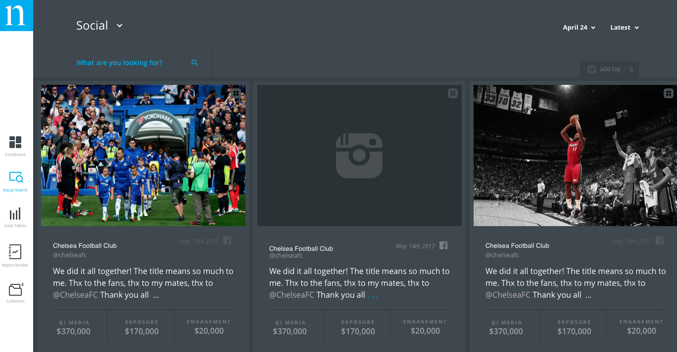
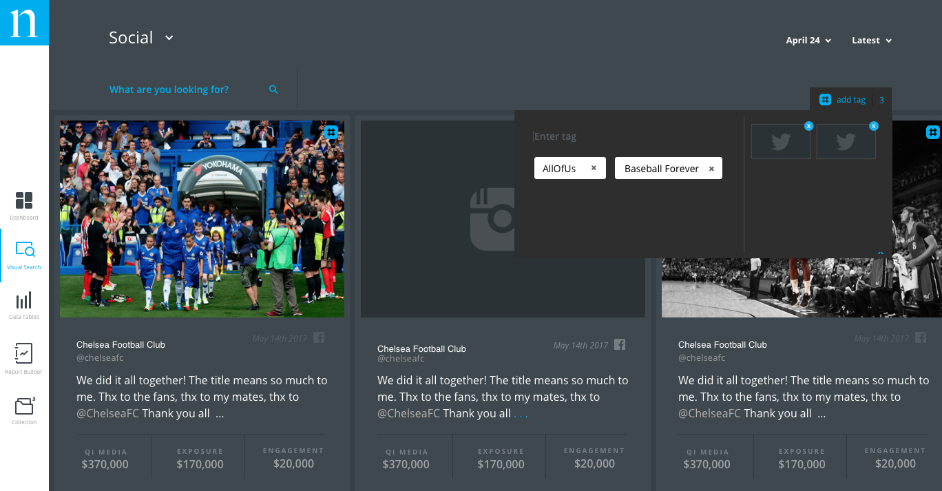
We continued to enhance the social data experience by redesigning how text only posts displayed to better use the space within the card, and eliminate the large icon images that did not provide any useful information to the user. We also integrated icons to inform the user the types of social posts being displayed such as albums and stories.

Connect 2.0
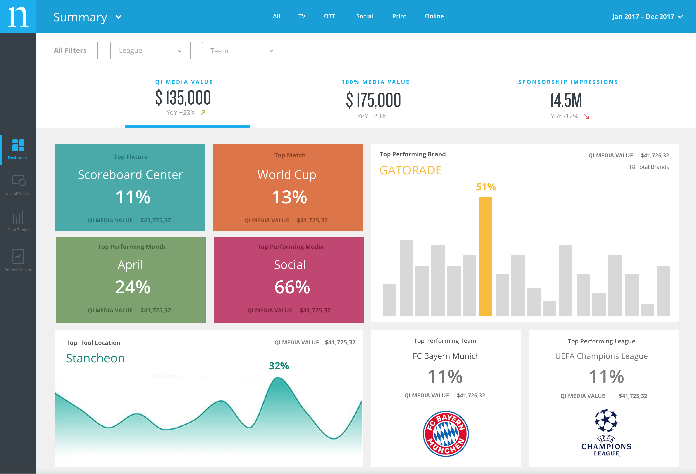
After 12 months of user research post MVP, two major pain points were identified:
1. no quick summary was available
Users wanted to log in each day and see a quick rundown of their data without having to apply filters and navigate to other areas of the dashboard.
2. the dashboards dark UI
The dark color scheme was difficult for many users to interact with on a daily basis and did not provide enough contrast for the charts and graphs to stand out.
We needed to address these major pain points without requiring a large engineering effort. The solution was to flip the color scheme from the white sidebar/grey dashboard to a grey sidebar/white dashboard.
